Looking for our weekly blog hop- Click Here
------------------------------------------------------------

Ever wonder what others think about your blog? I know I do and so does one of our curious reader: Melissa of Mulberry Creek. Melissa started her blog in January of 2012 to help support the
Handmade Movement and to help others learn more about her Etsy Shop. Her
blog also features favorite recipe, DIY tutorials projects, urban
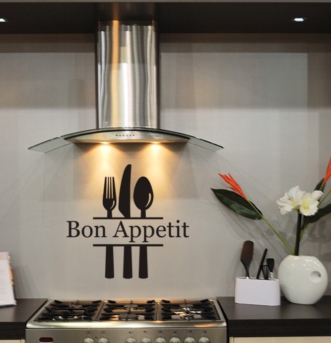
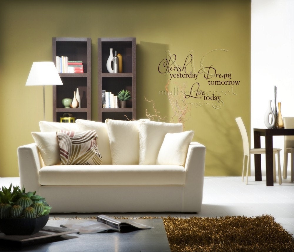
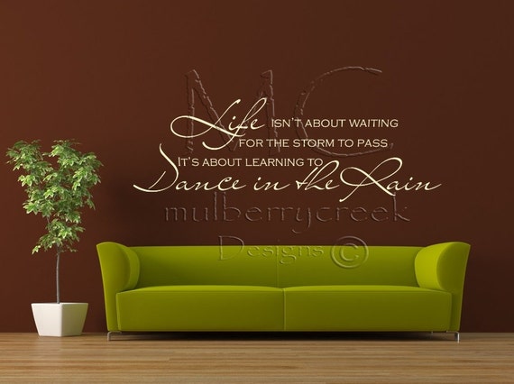
gardening and favorite books. Be sure to check out her shop. It's pretty amazing. Here, you can be the judge.
After reviewing her blog, here's what I like:
-Love the posts. Very interesting and informative with great pictures.
-Love the Etsy Shop button. Your shop is amazing. (But see below)
-Banner
-Page tabs
-Great 'About Me' page
-Like how clean the side bar is
Improve:
-For the page tabs- maybe add a DIY section. I love your DIY instructions and would love to be able to find a list of DIY projects.
-Have a link to your shop. I clicked on the etsy mini but it didn't take me anywhere...
-Hmm.. This is just my opinion... but I feel that your page is a little too "dark". To me, it doesn't showcase your amazing posts or products. The blog should compliment the bright and colorful pictures you have posted.
What are your thoughts? Please let Melissa know by leaving a comment below. As always, constructive criticism is
welcome. =) Don't forget to drop by her shop!


I really like your blog!
ReplyDeleteMy only suggestions would be for you to add a d.i.y tab so the readers can easily find a project if needed.Also, if it is possible for your Etsy Mini to be resized so that it doesn't look like it's hanging off the side bar, it would look a little neater.
Keep up the good work!
-Ashley Udoh
www.ashleyudoh.blogspot.com