
Looking for our weekly blog hop? Click Here
Don't forget to visit our other blog critique for the week:
Click Here
-------------------------------------------------------------------
Ever wonder what others think about your blog? I know I do and so does one of our curious reader: Laila of Townhouse Palette. Laila started her blog in December of 2011 to help teens or anyone that is a beginner to the beauty and fashion world improve their knowledge on it.Being new to the blogging world, Laila would love your advice on her she can improve her blog.
After reviewing her blog,
Here's what I like:
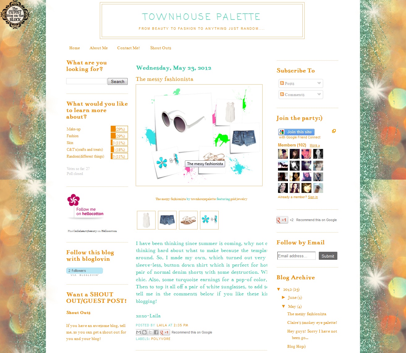
--Cute and bright layout. Love the "The Cutest Blog on the Block" icon on the side
-Posts are pretty informative.
-Love how she engages with her readers at the end of every post; by asking a question that they can answer or give their opinion on.
-Majority of the photos are good- bright and clear.. but there are a few that could use some retouching (see below)
-Good placement of Tabs- About Me, Contact, Shout Out. Makes it easy to find.
-Good placement of the side bars and of search bar, follow button, subscribe to... I also like how she has two side bars.
-Guest Post Information- I like how she lets you know that you can guest post on her blog
-Like the Poll on the side... It lets us know she cares about her readers and their opinion. It also shows her dedication to improving her blog.
-Always nice to have a Disclaimer-- especially for a beauty blog.
Here's what I think she can improve on:
-The majority of the photos are good, but there are a few that are a little too dark and can use some retouching.
-Add social icons/buttons- twitter, facebook, etc.
-Could use a little more color.. The blog looks too simple. Also, I am not too sure about the orange and teal colors.. I am just not too fond of it.
-I feel like there's too much white space... especially in some of the post (too much space between the paragraphs, perhaps??).. Maybe use different colors to highlight and separate the sections.
-Blog more often!! Or at least be consistent. Don't blog twice in one week then the following week not blog at all. It's important to be consistent.
-Move 'Thanks for visiting:' to the bottom.
---------------------------------------------------------------
Ever wonder what others think about your blog, website, product, etc? Well, now you can. If you are interested and would like your blog, website, or product critiqued by our readers, please send a brief description of your blog/product to bloglovetherapy@gmail.com. ATTN: Critique.

My two cents on Townhouse Palette:
ReplyDeleteHere's what I like:
- The background is lovely
- Posts are very neat
- Sidebars are organized
- All blog sections are clearly defined
- Photos are focused and well framed
What I don't like:
- Banner doesn't do justice to the content and overall look of the blog, it's too plain
- The primary font colour, it's a bit too bright for my taste, it can be a bit difficult to read. I get it was taken from the picture, as well as the orange, but for reading I suggest black or grey.
Best of luck for Laila with her blog ^^
I agree with the points that have already been mentioned especially the one about the text colors. Stick with black or something dark for the main body of your blog.
ReplyDelete